When I wrote a few weeks ago about reformatting my blog, I talked a little bit about how my perspective on the knitting world has changed over the past seven years. As I sit down to review the brand-new Rowan Magazine (thank you, Westminster Fibers, for sending me a review copy!), I started thinking about how my take on pattern collections has evolved.
As a relatively new knitter, when I looked at patterns, I thought about them in terms of me: did I personally like any of the patterns in the collection? would I want to make any of the patterns in the collection? would the garments suit my personal style and be flattering to my body type? would some difficult technique or the amount of work needed to create the garment make it not a feasible project for me to make? Me, me, me.
Over the years, I’ve seen a lot of knitting patterns: the good, the bad and the ugly. I have purchased a lot of knitting patterns. And I have grown to accept the fact that I already have enough projects in my Ravelry queue to last several lifetimes over. When I look at pattern collections now, I tend to think about them with a broader perspective, without reference to me personally. Are the patterns good-looking, even if they wouldn’t suit my plump, middle-aged body? Are the designers doing interesting and creative things, rather than the same old thing again and again? Are the patterns tracking some trend in the contemporary fashion world, even if that trend might not be as popular among handknitters? Is the presentation appealing–do the garments fit properly, are they styled well, can you see pattern details clearly, is the whole package pleasing?
I’m starting out by mentioning all of this because I think it can be really hard for a company or designer to put out a new collection that does all those things at once. If a collection consists of very wearable patterns, without too high a difficulty level, then someone will complain that “the patterns are too easy, I wouldn’t pay for them.” If a collection includes elements or trends that reflect what’s happening during Fashion Week, then someone else complains that the patterns aren’t wearable for the typical knitter (“who wants to wear a sweater with a big kitty cat on the front!”). If the company adopts a particular look and sticks with it, they are boring and playing it safe (“it’s just another book of pretty patterns, ho hum”), but if they try something different, observers will complain that they hate the look because it’s too way out (“why are they all wearing Maori war paint?”).
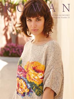
I have loved Rowan yarns and patterns from the first time I saw them, and still love them passionately today. They have produced an incredibly consistent stream of quality yarns and patterns, with an emphasis on English country style. I love that they still publish sweater patterns that feature intricate cables or multicolored stranded work or lace. I love that their Magazines and booklets are always beautifully styled and photographed. I love that they try some new things to keep from being bored (or boring), while still remaining true to their overall style. And so when I did some Googling about the brand-new Magazine, number 53 (Spring/Summer 2013), I got a little crabby when I read what some critiquers had to say.
Yes, there are a lot of dropped shoulder and modified dropped shoulder patterns in this Magazine. Sometimes it’s just not feasible to do multiple sizes of complex intarsia or intricate stitch patterns using set in sleeves or raglans or yokes.
Yes, floral intarsia and graphic colorblock are not for everyone. Some people don’t like to knit intarsia (raises hand) and some people feel that they will look like an overstuffed couch wearing a large-scale floral pattern (raises hand), but they are important trends in the fashion industry right now.
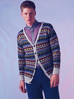
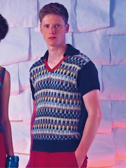
Yes, many guys are not especially tuned into fashion trends and therefore may shy away from some of the bolder designs presented for men.
Yes, some of the stitch patterns and structures push the envelope a little relative to what most hand knitters make.
Get over it.
Because when you get right down to it, Number 53 is a beautiful, well-presented collection of warm-weather patterns echoing the fashion themes you’ll see on runways all over the world. Let’s take a closer look at the magazine, and I’ll show you what I mean.
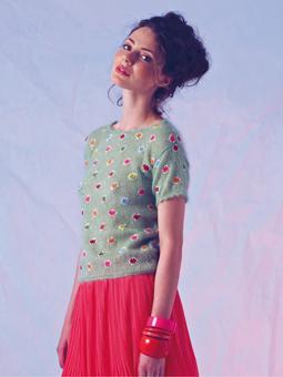
As usual, the Magazine is divided into three themes or “stories.” In keeping with the spring/summer focus, the first story is called “Glorious,” and was photographed on the Greek island of Santorini. Accordingly, all eleven designs all have Greek-inspired names, and feature warm, bright colors, with floral motifs prominent. Big-scale intarsia prints are a hot fashion trend and this trend is reflected in the half-dozen or so intarsia pieces.
Kaffe Fassett adopts the all-over approach with Corfu, featuring happy daisies on a background of heathered blue. Note that different yarns from the Rowan family are mixed together; the same Purelife Revive that’s used for the background, plus Wool-Cotton and double-stranded Wool Cotton 4-ply–are used for the intarsia motifs.
Martin Storey’s Hydra also uses all-over floral patterning, and this is a very wearable sweater, in Siena 4-ply.
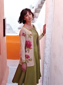
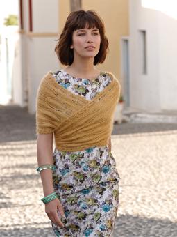
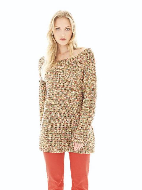
The cover sweater, Santorini, features a big and colorful floral motif on the front.
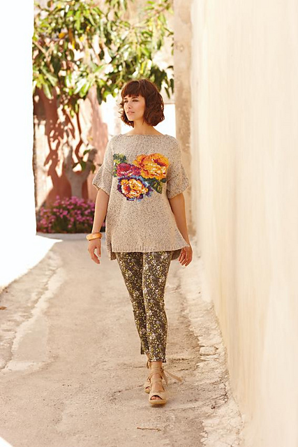
Although I liked the cover photo, I have to confess that this sweater is my least favorite in the bunch, perhaps because the exaggerated dropped shoulders and the sweater/tights combo are giving me 1980s flashbacks…
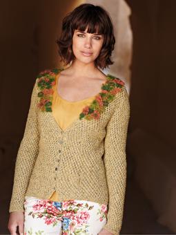
Marie Wallin’s Kefalonia uses floral colorwork on the cardigan body but not the long sleeves, making this a little less labor-intensive for those who aren’t crazy about intarsia:
This is a much more attractive shape and fit, and the simple colored edging pulls it all together nicely.
Marie Wallin translates the floral motif into a lovely lightweight sweater, knit with Fine Lace and KidSilk Haze:
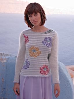
Using a softly-striped background for the body makes the floral design even more striking.
Lisa Richardson opted for a knit cardigan (again in heathered Purelife Revive, which is made from recycled fibers) and used crocheted flowers to embellish the neckline:
I can’t wear yellow shades, but I can imagine this cardigan in many different colors, and it would be a lot of fun to play with the color choices for the crocheted flowers. It would look smashing in a bright color, with one soft neutral shade of Kidsilk Haze for all the flowers. (Hmm, I may add that one to my Ravelry queue…)
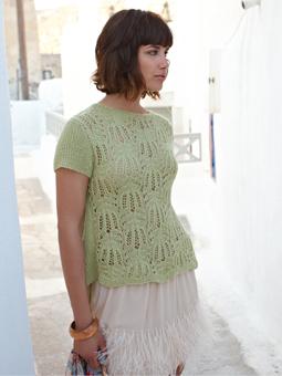
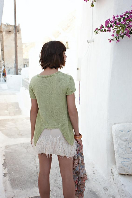
Crete, by Martin Storey, features a delicate floral motif done in eyelets at the hem and cuffs, in keeping with the theme, and this is a simple but elegant sweater that would flatter a lot of body types.
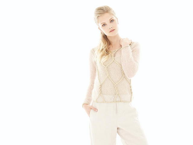
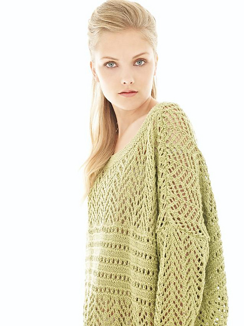
If intarsia (or flowers) aren’t your thing, check out the lovely lace wrap:
or an exquisite lace top by new-to-Rowan designer Vibe Ulrik:
The top features two curving sections at each hip:
which I might omit were I to make this one myself, as I feel that my hips need no further embellishment.
The second story is called “Ikon,” and is inspired by 19202 & 1930 modernist graphics–again, a hot trend in the fashion world. My favorite in this section has to be Josh “the Knituation” Bennett’s Vidal, knit in this wonderful geometric pattern in Creative Linen:
I happened to see this very sweater at VK Live, worn by the handsome Mr. Bennett himself. The blue on blue colorway keeps the geometric design from being overwhelming. Well done, you.
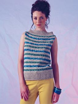
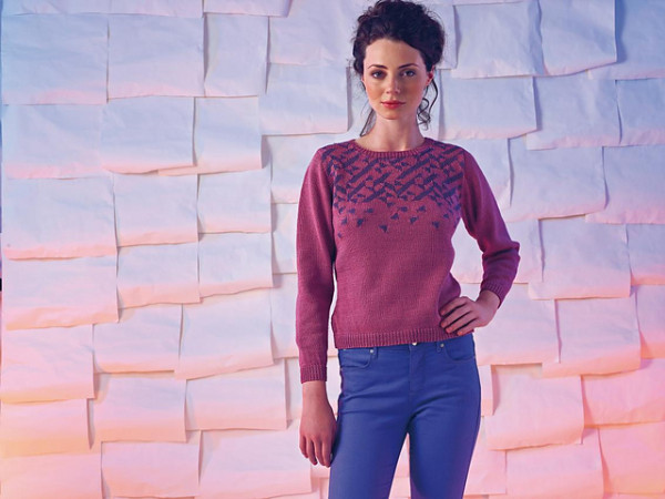
I was also quite taken with the multicolored chevron stitch top by Lisa Richardson, mixing three different fine-gauge yarns to get the rich colorful effect.
![]()
Again, you could get some very different looks with this top by scaling it back to one color or even two, or you could go crazy and use up odd balls and leftover bits. While there is some subtle waist shaping, I might even consider dropping down a needle size when I got to the waist to nip it in a little more without having to worry about working increases and decreases into the pattern.
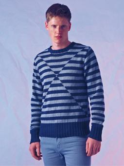
Martin Storey can always be counted upon for colorwork. Carnaby is knit stranded style, but tends away from traditional fair isle motifs, instead using geometric shapes reminiscent of African textiles.
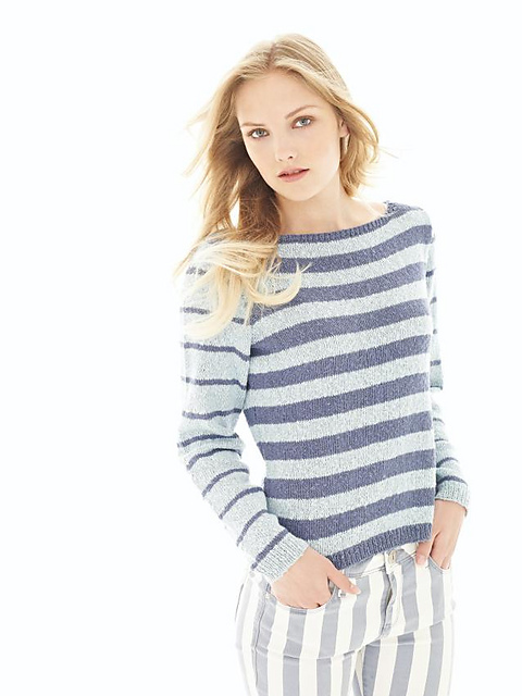
It’s interesting to see the different ways that the designers played with the modernist theme. Mod, by Ruth Green, has a Mondrian feel to it:
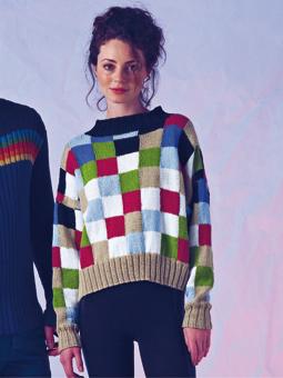
and I can appreciate the designer’s goal of playing with color blocks, then echoing the squares in the boxy shape (which for most of us, would admittedly be hard to wear).
Kaffe Fassett went for dots instead of squares in Pixie, another of my favorite designs. I like the way the Kidsilk Haze body gives a slightly fuzzy, sheer look, while the mercerized cotton used for the dots adds not only color but an altogether-different finish.
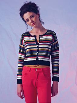
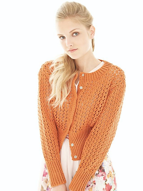
Marie Wallin opted for boldly-colored stripes in her cropped cardigan.
and then takes a simple checkerboard pattern and adds rapid changes of color, creating a striking pattern that looks so much more complex than simple boxes would:
Galina Carroll’s sleeveless sweater uses closely-allied hues of blue and green in a heathered yarn to create a garland-like stripe:
The third and final story is the “Essentials,” which focuses on shape and pared-down style. This story features deliberately-minimal styling so that the shapes of the knitwear take center stage (I would suggest, however, not using quite so washed-out an effect next time as it makes the details of some of the sweaters too hard to appreciate). Just when I feared I would have to lodge a complaint with Kate Buller for the lack of Sarah Hatton in this issue, I eagerly saw Cappuccino, a lovely and quite cleverly-designed top with multidirectional ribbing.

Another standout piece is Julia Frank’s Marshmallow:
Not easy to wear, but pushing the envelope. Note how Frank uses I-cord in a worsted-weight yarn to embellish a very lightweight mesh-y Kidsilk Haze top. Striking and strikingly creative.
Marie Wallin’s Bubblegum features two stripe patterns in a very wearable boat-neck sweater:
while Banoffi
and Cookies & Cream fall into the summer layers category, airy and loosely-shaped for putting over a tank top when the sun goes down.
Honeycomb is a pretty cardigan, combining ribbing with lace to charming effect.
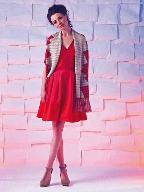
If you sign up for the free Row@n club online, you will get access to some extra downloadable patterns, including this Beehive Wrap by Galina Carroll:
and Marie Wallin’s crew-neck, which cleverly deconstructs the color pattern as it moves down the front of the sweater.
Articles include an interview with Vibe Ulrik, a Dane who is one of the newest Rowan designers; a look at Sonia Delaunay and the modernist movement of the 1920s and 1930s (inspiration for the Ikon story above); a brief look at cotton fiber; a preview of Martin Storey’s new book, Scottish Heritage Knits; and a closer look at the isle of Santorini. Patterns feature schematics and black-and-white charts, and tend to be sized from Small to XXL (around 35-36 to 52-54 inch finished bust circumference). There are a total of 34 patterns in the Magazine, with 3 more available for download as described above. These are mainly sweaters and tops, the two exceptions being shawls/wraps. Five of the sweaters are for men, with the rest for women; no children’s patterns in this one.
So there you have it. Rowan Magazine 53, available now in fine LYSs (like Philly’s Loop).
All photographs copyright 2013 by Rowan/Westminster Fibers; used with permission for review purposes.
Thank you for the, as always, insightful review. I already knew I would be getting a copy of this Rowan as I’ve been a subscriber since I stopped working at a yarn shop – where I still bought copies, I was just surrounded by yarn more often. I love Rowan’s disigns less as actual wearable pieces, personally, and more as inspiration. For instance, while you are right saying Frank’s piece would be hard for any non-waiflike model to wear I instantly saw ‘pillow cover’ in the details and raised i-cord styling. Many of the intarsia charts and designs I’ve gathered in Rowan magazine’s over the years have found their way into completely different projects from the designer’s original intent as ‘wearable item’ like that. And I love them for it.
As so often, Carol, a thoughtful and comprehensive review. Really wonderful to have you providing these for us.
Thank you, Carol. It is a great review for those who loves Rowan. I am always waiting for new issue.
Galina